Problem Set 3
MLB Batting Statistics
In this problem set, you will practice using the pipe %>% and grouped calculations with batting statistics taken from the Lahman dataset. We will compute the same statistics as we did in Problem Set 3 and also standardize these statistics within year, year and league, and also historical era.
To load the batting data into R, we can do the following
Unfortunately, some statistics like hit-by-pitch (HBP) were not recorded in the earlier decades of baseball. In the tbl, these missing values are designated NA. To see some of these, we can run the following code:
> batting %>%
+   select(playerID, yearID, teamID, AB, BB, HBP, SH, SF, IBB, GIDP)
# A tibble: 105,861 x 10
   playerID  yearID teamID    AB    BB   HBP    SH    SF   IBB  GIDP
   <chr>      <int> <fct>  <int> <int> <int> <int> <int> <int> <int>
 1 abercda01   1871 TRO        4     0    NA    NA    NA    NA     0
 2 addybo01    1871 RC1      118     4    NA    NA    NA    NA     0
 3 allisar01   1871 CL1      137     2    NA    NA    NA    NA     1
 4 allisdo01   1871 WS3      133     0    NA    NA    NA    NA     0
 5 ansonca01   1871 RC1      120     2    NA    NA    NA    NA     0
 6 armstbo01   1871 FW1       49     0    NA    NA    NA    NA     0
 7 barkeal01   1871 RC1        4     1    NA    NA    NA    NA     0
 8 barnero01   1871 BS1      157    13    NA    NA    NA    NA     1
 9 barrebi01   1871 FW1        5     0    NA    NA    NA    NA     0
10 barrofr01   1871 BS1       86     0    NA    NA    NA    NA     0
# … with 105,851 more rows
A common convention for dealing with the missing values when computing \(\text{PA}\) is to replace the NA with a 0. To do this, we can use the function replace_na() within a pipe as follows.
> batting <-
+   batting %>%
+   replace_na(list(IBB = 0, HBP = 0, SH = 0, SF = 0, GIDP = 0))
> batting %>% select(playerID, yearID, teamID, AB, BB, HBP, SH, SF, IBB)
# A tibble: 105,861 x 9
   playerID  yearID teamID    AB    BB   HBP    SH    SF   IBB
   <chr>      <int> <fct>  <int> <int> <dbl> <dbl> <dbl> <dbl>
 1 abercda01   1871 TRO        4     0     0     0     0     0
 2 addybo01    1871 RC1      118     4     0     0     0     0
 3 allisar01   1871 CL1      137     2     0     0     0     0
 4 allisdo01   1871 WS3      133     0     0     0     0     0
 5 ansonca01   1871 RC1      120     2     0     0     0     0
 6 armstbo01   1871 FW1       49     0     0     0     0     0
 7 barkeal01   1871 RC1        4     1     0     0     0     0
 8 barnero01   1871 BS1      157    13     0     0     0     0
 9 barrebi01   1871 FW1        5     0     0     0     0     0
10 barrofr01   1871 BS1       86     0     0     0     0     0
# … with 105,851 more rows
The syntax for replace_na() is a bit involved but the basic idea is you have to specify the value you want to replace each NA. When using replace_na() it is very important to remember to include the list(...) bit.
Load the Lahman data and run the above code to create the tbl
Batting, which has replaced all of theNA’ in the columnsIBB, HBP, SH, SFand GIDP`.Using the pipe
%>%,mutate(),filter(), andselect(), create a tblbattingby:
- Adding columns (with
mutate()) for plate appearances (PA), unintentional walks (uBB), singles (X1B), batting average (BA), on-base percentage (OBP), on-base plus slugging (OPS), and weighted On-Base Average (wOBA). Note that the formula for plate appearances is \(\text{PA} = \text{AB} + \text{BB} + \text{HBP} + \text{SH} + \text{SF}.\) Formulae for the remaining statistics are given in Problem Set 3. - Pulling out only those rows of players with at least 502 plate appearances and who played in either the AL or NL with
filter() - Select the following columns: playerID, yearID, lgID, teamID, PA, BA, OBP, OPS, wOBA.
- Standardize each of BA, OBP, OPS, and wOBA using data from all of the years. Who were the best and worst batters according to these four metrics? Name the columns containing these new standardizedvalues
zBA_all,zOPB_all, etc. Remember, you must re-define thestandardize()function we wrote in Module 4
> standardize <- function(x){ (x - mean(x))/sd(x)}
> batting <-
+   batting %>%
+   mutate(zBA_all = standardize(BA),
+          zOBP_all = standardize(OBP),
+          zOPS_all = standardize(OPS),
+ zwOBA_all = standardize(wOBA))- Group
battingby year and compute the standardized BA, OBP, OPS, and wOBA within each year. Now who are the best and worst batters according to the four measures? Name the columns containing these new standardized valueszBA_year,zOBP_year, etc.
> batting <-
+   batting %>%
+   group_by(yearID) %>%
+   mutate(zBA_year = standardize(BA),
+          zOBP_year = standardize(OBP),
+          zOPS_year = standardize(OPS),
+ zwOBA_year = standardize(wOBA))- Remove the grouping by year and instead group by year and league. Once again, standardize OBP, OPS, and wOBA within each league-year combination. Are the best and worst batters still the same? Name the columns containing these new standardized valuse
zBA_year_lg,zOBP_year_lg, etc.
> batting <-
+   batting %>%
+   ungroup() %>%
+   group_by(yearID) %>%
+   mutate(zBA_year_lg = standardize(BA),
+          zOBP_year_lg = standardize(OBP),
+          zOPS_year_lg = standardize(OPS),
+ zwOBA_year_lg = standardize(wOBA))- Remove the grouping you created in Problem 4. Bill James divided baseball history into several eras as follows:
- Pioneer Era: 1871 – 1892
- Spitball Era: 1893 – 1919
- Landis Era: 1920 – 1946
- Baby Boomer Era: 1947 – 1968
- Artifical Turf Era: 1969 – 1992
- Camden Yards Era: 1993 – present
> batting <-
+   batting %>%
+   ungroup() %>%
+   mutate(HIST_ERA = case_when(
+     1871 <= yearID & yearID <= 1892 ~ "Pioneer",
+     1893 <= yearID & yearID <= 1919 ~ "Spitball",
+     1920 <= yearID & yearID <= 1946 ~ "Landis",
+     1947 <= yearID & yearID <= 1968 ~ "Baby Boomer",
+     1969 <= yearID & yearID <= 1992 ~ "Artifical Turf",
+     1993 <= yearID ~ "Camden Yards")) %>%
+   group_by(HIST_ERA) %>%
+   mutate(zBA_hist = standardize(BA),
+          zOBP_hist = standardize(OBP),
+          zOPS_hist = standardize(OPS),
+          zwOBA_hist = standardize(wOBA))
Use mutate() and case_when() (just like we did in Module 3) to add a column called Hist_era to batting that records the historical era.
Group
battingby Hist_era and standardize BA, OBP, OPS, and wOBA within historical era. Who are the best and worst batters now? Name the columns containing these new stanardized valueszBA_hist,zOBP_hist, etc.Remove the grouping you added in Problem 6.
MLB Payroll and Winnings
Recall from Problem Set 2, we plotted the relative payroll of MLB teams against their winning percentage. In that problem set, we read in a file that had included the relative payroll for each team as a separate column. To get some additional practice with dplyr, we will read in a different dataset and re-compute these relative payrolls.
- Remember the function we wrote in Module 4 to standardize various statistics? It is reproduced below
> standardize <- function(x){
+   mu <- mean(x, na.rm = TRUE)
+   sigma <- sd(x, na.rm = TRUE)
+   return( (x - mu)/sigma)
+ }
We need to write another function in order to compute “relative payroll”. This function will take in a vector x, compute its median, and then divides every element of x by the median.
- Read in the MLB Payroll Data and load it into a tibble called
mlb_payrolls.
Parsed with column specification:
cols(
  Team = col_character(),
  GM = col_character(),
  Team_Payroll = col_double(),
  Winning_Percentage = col_double(),
  Year = col_double()
)
Using the pipe
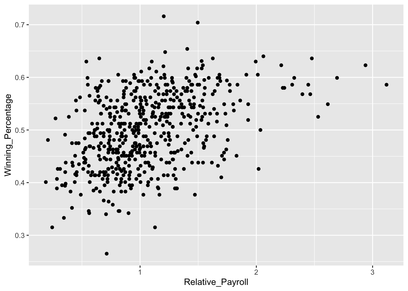
%>%,group_by(), andmutate(), add a column tomlb_payrollsthat contains the relative payroll for each team.Make a scatterplot of winning percentage against relative payrolls. Comment on the relationship. Your scatterplot should be identical to one you made in Problem Set 2.
Using the
summarize()function, compute the average team payroll and relative payroll for each year. Save these results in a new tbl calledpayroll_avg.Make a scatterplot that shows how team payrolls have evolved over the year. Similar to what we did in Module 4, add a line to this scatterplot that shows the average team payroll. Do the same thing for relative payroll. What do you notice about the average team payroll and relative payroll?
As you will see in coming lectures, correlation is a measure of the strength of the linear relationship between two variables. The closer to +1 or -1 the correlation between two variables is, the more predictable they are of each other. We can compute it using the
cor()function. Usingsummary()andcor(), compute the correlation between relative payroll and winning percentage within each year. What do you notice about how the relationship between winning percentage and relative payroll changes year to year?
# A tibble: 18 x 2
    Year   cor
   <dbl> <dbl>
 1  1998 0.764
 2  1999 0.699
 3  2000 0.327
 4  2001 0.338
 5  2002 0.443
 6  2003 0.415
 7  2004 0.515
 8  2005 0.497
 9  2006 0.538
10  2007 0.495
11  2008 0.322
12  2009 0.504
13  2010 0.347
14  2011 0.408
15  2012 0.195
16  2013 0.330
17  2014 0.297
18  2015 0.281
A Challenge Question
Without running the code, work with your teammates to see if you can figure out what the code below is doing.
> batting_2014_2015 <-
+   batting %>%
+   filter(yearID %in% c(2014, 2015)) %>%
+   group_by(playerID) %>%
+   filter(n() == 2) %>%
+   select(playerID, yearID, BA) %>%
+ arrange(playerID)- Run the code above and save the tbl
batting_2014_2015.RDatato the file “data/batting_2014_2015.RData”. We will return to this dataset in Lecture 4.